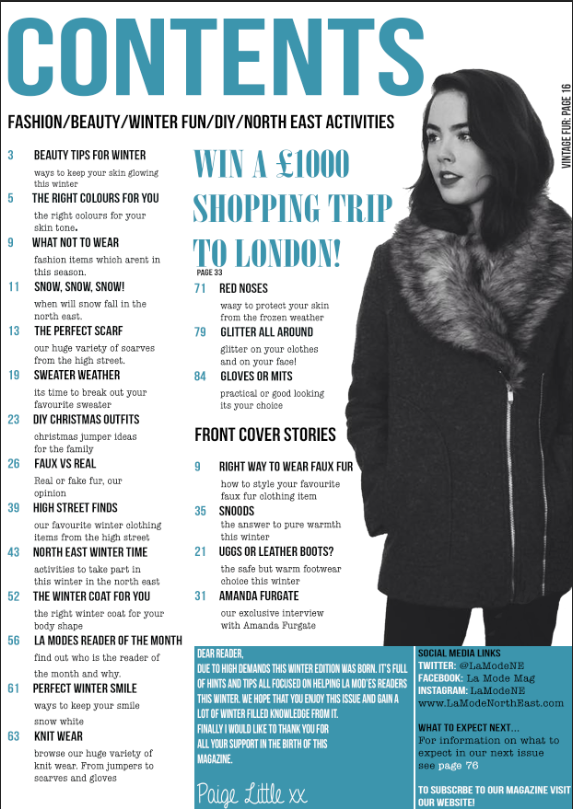
Since last time my contents page has really excelled, due to it being almost completed. I have added the main image and all the contents. I also added a editors note, and further social media networking site in the box located in the bottom right corner. I also added a small competition area, which stands out amongst the rest of the text. I carried on with the Teal color as I like the way they color scheme looks with everything in the magazine. The only thing left to do on this contents page is to add a small image of an editor in the editors note section.
Wednesday, 26 November 2014
Wednesday, 12 November 2014
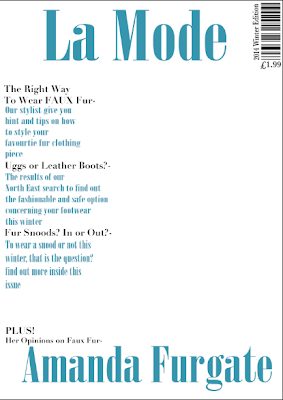
Front Cover - So Far
So far, As I haven't took my photos I have managed to put together the magazine's layout and the text. Of course when I add the images I may need to move things around but for now this is how i want the magazine's front cover to look. The front cover image needs to help with the color scheme but also it has to be able to tie in well with the winter edition theme I have gone for.
I have used two man in colors, Black and Teal. I think the teal really helps makes the magazine look more wintery. This color will then be used more inside the magazine.
Contents Page - So Far
So Far, like my font cover I have made the layout and text of this page, I will add the pictures at a later date. The same colors have been used and the fonts vary depending on the types of information. I added an editors note, due to the magazine being only regional I feel like this makes it feels more communal and easier to approach.
Doble Page Spread - So Far
Finally I am still waiting on the images for my double page spread. I have made up the story and adapted it to fit the issue of the magazine, The winter edition. I made up the person and made the sell line controversial which would cause discussions which in turn would create more sales for the magazine. By using the topic of fur I am using the winter theme. I didn't want too much writing so I just made a small paragraph then advertised the website. page numbers have also been added.
Wednesday, 5 November 2014
Test Shots
I first took the image and then decided to edit it to see which effect worked best for the coat and made it look more comfy and suitable for winter. I decided to just increase the contrast and shadows on the first one, By doing this i made the coats texture look more prominant, However I didnt edit it too much as I didnt want it to look too dark and unappealing. The seconda image was then edited to increase the brightness and warmth therefore it would make it look more bright and cosy, Which is what I want however as a consequence the editing makes the coat look a bit too bright and makes it look cheaper, Therefore if I was to use this edit then I would have to make sure that I dont make the brightness too high. I then tested the image in black and white, by doing this it fits in with my colour scheme however it also makes the coat look very high fashion, where as its from a highstreet shop.
As part of my earlier research and planning I was asked to reconstruct a magazine front cover, the image i used for this was of the same person and she was wearing another winter appropriate coat, This is also another test image which includes a item of clothing which could be used in my magazine. I went through the same process with these images, and edited them the same as the ones above.
Organising Test Shots
Initial Clothing Ideas
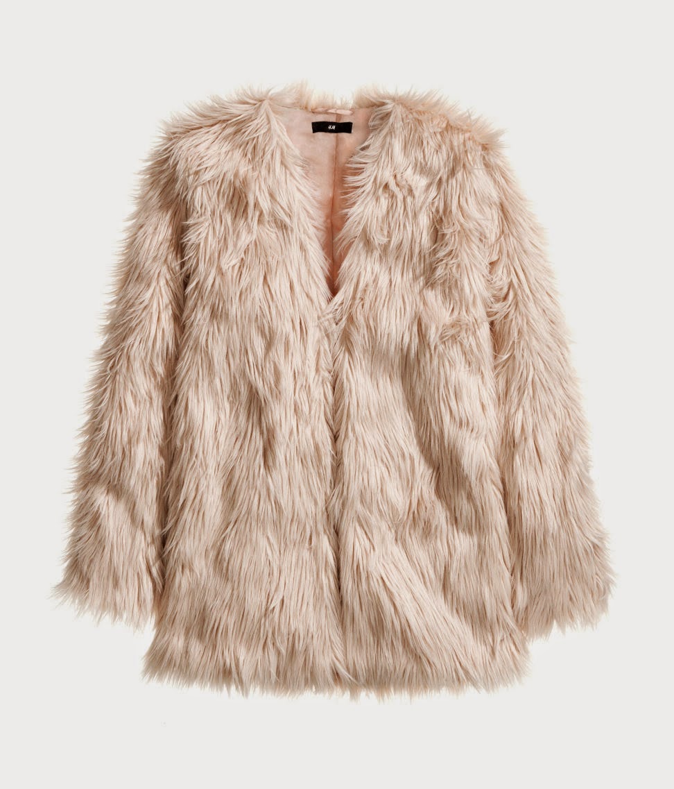
When coming up with the ideas for my costume and what I want the model to look like I want to get inspiration from other winter edition magazines. I think I am certain on having my model wearing a large wintery coat, preferable with fur and warm looking clothing. I will include images of the type of garments i will expect to be featured in my winter edition magazine.
As I have a friend who owns these particular coats, I am going to ask permission to use one of them in my magazine, but first I will take some test shots to see how the coat looks and if its what I'm looking for to have in my magazine.
Subscribe to:
Comments (Atom)


