Wednesday 26 November 2014

Contents Page Development


Since last time my contents page has really excelled, due to it being almost completed. I have added the main image and all the contents. I also added a editors note, and further social media networking site in the box located in the bottom right corner. I also added a small competition area, which stands out amongst the rest of the text. I carried on with the Teal color as I like the way they color scheme looks with everything in the magazine. The only thing left to do on this contents page is to add a small image of an editor in the editors note section.

Wednesday 12 November 2014

Front Cover - So Far


So far, As I haven't took my photos I have managed to put together the magazine's layout and the text. Of course when I add the images I may need to move things around but for now this is how i want the magazine's front cover to look. The front cover image needs to help with the color scheme but also it has to be able to tie in well with the winter edition theme I have gone for.

I have used two man in colors, Black and Teal. I think the teal really helps makes the magazine look more wintery. This color will then be used more inside the magazine.


Contents Page - So Far


So Far, like my font cover I have made the layout and text of this page, I will add the pictures at a later date. The same colors have been used and the fonts vary depending on the types of information. I added an editors note, due to the magazine being only regional I feel like this makes it feels more communal and easier to approach.


Doble Page Spread - So Far


Finally I am still waiting on the images for my double page spread. I have made up the story and adapted it to fit the issue of the magazine, The winter edition. I made up the person and made the sell line controversial which would cause discussions which in turn would create more sales for the magazine. By using the topic of fur I am using the winter theme. I didn't want too much writing so I just made a small paragraph then advertised the website. page numbers have also been added.

Wednesday 5 November 2014

Test Shots

I first took the image and then decided to edit it to see which effect worked best for the coat and made it look more comfy and suitable for winter. I decided to just increase the contrast and shadows on the first one, By doing this i made the coats texture look more prominant, However I didnt edit it too much as I didnt want it to look too dark and unappealing. The seconda image was then edited to increase the brightness and warmth therefore it would make it look more bright and cosy, Which is what I want however as a consequence the editing makes the coat look a bit too bright and makes it look cheaper, Therefore if I was to use this edit then I would have to make sure that I dont make the brightness too high. I then tested the image in black and white, by doing this it fits in with my colour scheme however it also makes the coat look very high fashion, where as its from a highstreet shop.

 
These test shots turned out really well and have really helped with the progress of my magazine and the type of editing I want to use. After looking at all the images I have decided to make the editing subtle yet it need to improve the garment to make it appealing to the customer/reader.

As part of my earlier research and planning I was asked to reconstruct a magazine front cover, the image i used for this was of the same person and she was wearing another winter appropriate coat, This is also another test image which includes a item of clothing which could be used in my magazine. I went through the same process with these images, and edited them the same as the ones above.


Organising Test Shots

 
I text my friend Ellie who  owns the particular coat, I just wanted to take images of her in the coat so I can see how it looks on camera. As we were in college at the same time we were able to meet up after the text and take a few images. I justed wanted them to be rough therefore they arent no where near the level of perfection which is required for my magazine.

Initial Clothing Ideas

When coming up with the ideas for my costume and what I want the model to look like I want to get inspiration from other winter edition magazines. I think I am certain on having my model wearing a large wintery coat, preferable with fur and warm looking clothing. I will include images of the type of garments i will expect to be featured in my winter edition magazine.


As I have a friend who owns these particular coats, I am going to ask permission to use one of them in my magazine, but first I will take some test shots to see how the coat looks and if its what I'm looking for to have in my magazine.


Wednesday 22 October 2014

Self Assessment


As part of a marking exercise we were asked to mark our own blogs based on the same criteria as the Peer Assessment task we did. I decided that I think my blog so far is at a much higher standard than last year, and last year I was given only a D for my research and planning. Based on my posts and the content in the posts is relatively proficient and at a better level than last year. I gave my blog so far 13 marks which is a grade C, Level 3. However I am yet to complete my blog therefore I hope to improve it to a even higher level upon completion.


Wednesday 15 October 2014

Magazine Name- Final Decision

After thinking about magazine name I want to come up with names that really represent a successful magazine. Therefore I have thought of some more name to accompany the front runner, Exposure. For example names such as La Mode, Forma.

I chose the new three options because I liked the idea of using the word fashion and changing the language to come up with another way of having my magazine called fashion without it coming across tacky.

When looking at the new names I really like "La Mode" because it sounds very fancy and really shows connotations of fashion. As its int eh french language where fashion really blossoms I feel like this is a really goof choice for my magazine.

To develop this Idea i have decided to see what it looks like in the different fonts I chose.


Finally the chosen name for my magazine is La Mode.

Front Cover Extended Flat Plan - Fonts

I then went through my fonts I have previously chosen and adapted my ideas to come up with the fonts I actually want on my front cover.

I chose two different fonts, a more structured font called 'Bebas Neue' which is used for the Mast head, Sell lines and the Main Sell line. I then chose a more laid back font called 'lazing on a sunday afternoon' which was used for the descriptions, issue number and the price.

I chose these fonts because I think they look good together and they represent the genre of magazine I want.

However as I am yet to decide on the sell line the font may change because the particular words may not look right in the font I have chosen at the moment.

Colour Scheme

When thinking of a color scheme I have to think about the actual theme of my magazine, As I plan on having a autumn/winter addition I need to come up with the colors that represent that particular season.

For Winter I decided on very cool tones, such as blues and treys, however I also included black and white as these colours will obviously be part of the magazine based on there diverse nature.


For an Autumn edition I chose reds, browns, and yellows, based on the connection it has to autumn. When I think of autumn I think of the leaves and trees, and all the colours that are around in that time.


I will post an update when I decide on the theme of the magazine and the colours scheme I have chosen.

Friday 10 October 2014

Font Choices - Initial Ideas

When coming up with font ideas I have used the website Dafont.com to help me find various style fonts. I first searched through the website and looks for fonts which i think are very similar to the type i want in my magazine. I chose to look for three different font categories for the 3 different fonts I need.  I then decided on three font ideas for the three different jobs of the fonts. I want a font for the mast head and age titles, Then another for an editors note, and another for the main text and sell lines.

These are the fonts that I have chose, I am yet to decide which fonts I want for each part of text in my magazine;


Magazine Name- Initial Ideas

When thinking about a name for my magazine I wanted to think of something that represented fashion and beauty however I also wanted something that was short and catchy and wasn't too obvious, Therefore I have been playing around with some names and trying to think of something which I was for my magazine. For example Exposure, InTouch or Original.

I also thought about certain initials. which could stand for something more obvious, for example TFM (The Fashion Magazine) or BFM (Beauty Fashion Magazine)

To help with my research I am going to ask my focus group on Facebook.

Wednesday 8 October 2014

Ancillary Task- Website- Reconstruction


My reconstruction is the bottom image. However I used a lot of the original website on mine. I did recreate the image, Title, subtitle and the borders on the page. When looking for inspiration for my website pages I will use vogues website because It looks very clean and simple, however it includes a lot of different tabs and page options. I made the model pull a similar pose, as she has a similar hair color this really helped with the reconstruction of the image. I then used the main sell line on that image and copied it over, however I had to edit out the background and place it in front of my image. I also took another vogue magazine and replaced the original one with the new one in the bottom left corner. I then added a new page title. I searched through the fonts to try and get one as close tot eh original as possible.

This will help with the creation of my magazine because I now know how a website can be set out, the type of images and page titles.

Ancillary Task- Billboard- Reconstruction

I chose to reconstruct this billboard due to the impact it make. The model is a very well know singer, Madonna. She is modelling for the well known company, Dolce & Gabbana. I recreated the billboard by having the model wear sunglasses and have her hair positioned similary to the model on the actual bill board. However I did have a problem getting the two exactly the same as i coulent get the background to be the same dark colour as the actual bill board. Therefore I decided to leave it white, then this would allow me to give reasons why I couldnt do it. This will help when creating mine as I now know that I cant physically do certain things. I did however add red lipstick to the model, Althought its not at a high level of quality it was only very roughly done.


Time Management- Update 2

My research and planning is borderline completion, apart from various video feedback, which are yet to be filmed and uploaded, I have done a lot of my work. However various bits and pieces which will help me get a higher mark still need doing, for example my reconstructions of the ancillary tasks and the deconstructions of a billboard.

My images will be complete during october half term, However I am yet to book the studio, as I want to ensure that my images will be at a higher quality and will help me achieve a higher level.

When looking at the rest of the action plan I am confident that I will be able to keep to the rest of the deadlines.

Shot List

To plan for my photo shot I filled out a table to help me keep track of the type of images I need and the variety I want. This will help me keep on track and will allow me to take only the required pictures, rather than wasting time on images I won't use and don't need.

Here is my Shot List;


Peer Assessment

As part of a class exercise we were partnered off and asked to follow certain criteria and mark each other blogs. I was partnered with Katie. We then gave each other our blog addresses and looked through the blogs. Katie looked through mine and then gave it a mark based on what she thought my blog was worth and if i followed the criteria in that certain level. Katie marked my work a 15/20 which means it was a level 3 based on her opinion of my blog.

Here is the marking sheet and criteria we were given;


Katies comments included;

"Nice blog layout"
"Good deconstructions"
"Good use of Facebook page to collect research"
"Really good reconstruction tasks"
"Good research into conventions of your chosen genre"
"Really detailed analysis in the deconstructions- you've broke down the conventions really well."
"Well done :)"

Katie also suggested that I could "update my blog with more time management information" therefore I will make sure to add a post every week to allow an update on how well I'm following deadlines and if there are any problems.

Was this task useful?

After taking part in this task I thought that it was good to get a second opinion on how well my blog is coming along and what I can do to improve it. I also found it helpful how i got to look at Katie's blog and see how much work she's done in comparison to mine. Katie's blog is very detailed in the description of her research and planning, therefore I could use this for inspiration in the standards that my blog should be at. However as Katie has chose a different brief from me we both have alternative tasks to fulfill in order to make sure our blogs are tailored to our chosen products.

It was also very useful as we got to look at the criteria that the marker will be following therefore I know what they are looking for and what I need to do to achieve a higher level than last year. I will use the criteria to make sure I am on track and doing what I'm supposed to do. Its also very useful as I can see exactly the different topics within the criteria and what they require to get a level 4.


The Recce


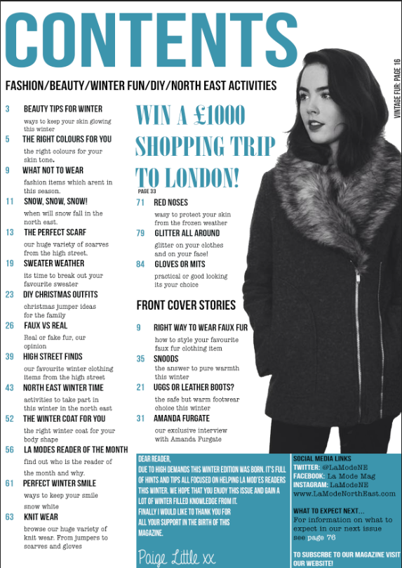
1.     Are there any potential hazards that could pose a health and safety risk where your photo shoot will take place?
When taking my images for my final product I will have to choose a location where there will be no hazards therefore I need to choose somewhere safe. I think due to huge task ahead I will need to choose a place where the background can be easily edited so I can have a clean looking image. The location is most likely to be indoors in a well know place I trust, therefore there will be no hazards. There could be potential objects in the way but nothing to hazardous to cause a major accident.
2.     What will you do to ensure these risks are minimised?
If there were any hazards or risks I will have to make sure that anyone involved in my photo-shoot are out of the way and not at risk of being hurt or injured. I also won’t allow the photo-shoot to go on if it means there is a risk of someone being hurt. If the objects in the way were causing a problem I would have to move them out of the way therefore the problem would be minimised.
3.     Will the time of day/weather affect the outcome of the photos? Have you allowed for this?
As the images will be taken inside the weather outside wont effect the images. The time of day for the images would have to be suited to when the studio have a slot for me, and when my model is free. The photos are definitely been taken during the day inside a studio.
4.     Have you considered the background to your photos, particularly if taken outside? How will you ensure you will get the background you want?
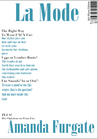
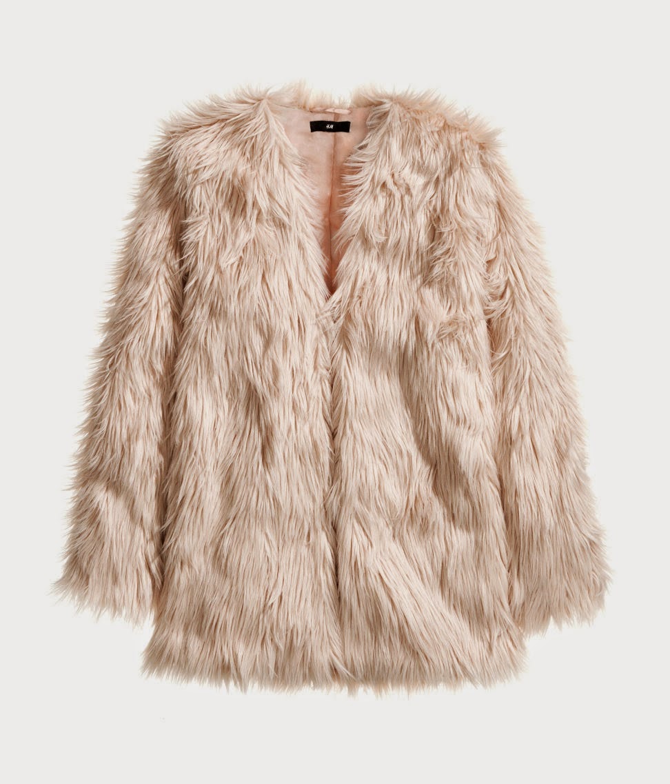
I have chosen to take my photos inside a studio this year due to the problems I had during my AS level and the editing of the images. I want a white/grey background therefore this will allow minimal editing to the background and it will look more professional. The studio where the pictures will be taken will provide the backgrounds as it is a studio designed for photo-shoots and professional image taking.
5.     Have you considered lighting? What about the ‘problems’ of natural lighting, either outside, or streaming through a window? Will you need to use a flash? Have you considered reflective objects that might spoil the effect?
The lighting in the studio will be artificial therefore there will be no problems with unwanted shadows or streams of light. I have been in the studio before therefore I know that there are no windows in the room. The outfit of the model wont include any reflective objects therefore if a flash is used then it wont beam back and cause a problem with my images.
6.     Do you need permission to take photos in the place/venue you have in mind?
When taking pictures in the studio you need to book with the owner therefore I will need to contact him and make sure it is ok for me to use his studio, and to come up with a suitable time for everyone involved.
7.     Do you need to book time in a room?
Yes, you have to confirm with the owner of the studio of a date and time, This allows me to be organised. There is also a lot of other students using the studio therefore I have to be patient and make sure I allow the owner to fit us all in at not only mine but his convenience.
8.     Are other people/crowds likely to be an issue for you? What have you done to ensure that it will not spoil the effect?
The images are only on one person therefore there will be no other models used in my magazine. I will make sure there are no other people by keeping them out of the way of the photo area. The other people in the room will be behind the camera or out of view.
9.     Are you reliant on lifts/props/friends’ equipment/models? How have you planned that these things will come together at the appointed time? Plan B?
Obviously I am reliant on the model due her huge part in the success of my product. However when organising the shoot I will have to make sure she is free and we can come to an agreement when choosing a time and date. The camera, which is provided to me by the college, is also a huge part in the success as this will allow the images to be of a better quality. Obviously I need something to take the images with. If for some reason my model can’t make it I will have to look into making sure I have an alternative model if worst comes to worst.
10.  Finally, have you thought of every eventuality…?

I have thought about the model not being able to come, however I will try my best to make sure that the time can be of her convenience  along with the studio owners. The location will have to be booked, however there may be a problem with making sure my model is free when my slot for the studio is. The lighting will all be artificial as its inside, therefore there wont be weather problems and there wont be any unwanted shadows/light.

Friday 3 October 2014

Double Page Spread Reconstruction


I made my model pull the same pose as the original model. She was wearing a similar outfit, the jumper. I then added the text very similar to the original. I picked the pink color directly from the original therefore the pink on my version is exactly the same. I then tried to get the grey background quite similar however it is a bit brighter than the original version of the double page spread.

This will help when creating my magazine because it is quite similar to how I want my magazine double page spread to look, mostly because it has one large image and minimal text, but mainly due to the overall feel of this double page spread. I found this reconstruction quite useful.

Contents Page Reconstruction


To follow on from me recreating a front cover I then had to re create a contents page. I chose this contents page because I feel like this was very similar to the type of contents page I want. I made the model change her hairstyle to try and mimic the model from the original. I then made my model pose similar to how it is in the original in hope of making the contents pages looking relatively similar. The colors used were pulled directly from the original therefore they are exactly the same. I made the reconstruction on photoshop the same as the front cover.

Wednesday 1 October 2014

Front Cover Reconstruction


 As part of my research and planning I was asked to recreate a fashion magazine front cover. I chose this image as the model has similar clothing and similar hair. When taking the image I made sure the models pose was similar therefore I could recreate it. I then opened the image in photoshop and edited it so there background was fully white.  I then added in the sell lines and main sell line, when doing this I made sure that the writing that was bold was cold on mine and so on. When adding the mast head I had to make several layers so I could get the wording behind my model. I was constantly switching between the two images to make sure I got them as similar as I could.

Friday 26 September 2014

Price Of A Regional Fashion Magazine Question

I asked my Facebook group what maximum price they were willing to pay. I was quite surprised at some of the answers due to the magazine being regional. However I thought that some of the answers were really reasonably and I will take them into consideration when coming up with a price for my magazine.There is a variation in prices in all the answers. As a result of this I need to come up with a medium price which is the overall average of the answers.

When deciding the price I need to remember that the price needs to reflect the magazines value. As it is a regional magazine the prices isn't going to be huge, however as I want the magazine to appear like a well made fashion magazine, I would like to think that the magazine could pass for not been completely cheap and worth it.

To help come up with a price I will use this information to help however I will also look at other regional magazines. Despite not been fashion orientated.


Ancillary Task/Website- Deconstructions

To show my research and planning for my first ancillary task, I have decided to make a PowToon presentation. In this presentation I deconstruct three magazines.

After looking at the high end fashion magazines I then looked at the regional magazine ETC's
website.

When looking at this website you can definitely tell that the genre of the magazine isn't totally focused on fashion. Regardless the website is very informative which is overall the whole point of the website. 

There is a very simplistic feel to this website as there is only three colors used receptively, white, black and purple. The whole appearance of this website isn't the most appealing when you compare it to the other three. However as this is a regional magazine website, this is reflected in the appearance/content of the website. There are some aspects of this website which are also on the higher end website, for example the different categories. 

There is also a social networking aspect added onto this website. At the top right hand corner of the page there are the icons for the three social networking sites Facebook, Twitter and Instagram. By doing this the website it promoting itself in more ways than the magazine and website.

This particular screen shot of the website is the fashion tab, The images on this tab are all focused around fashion some way or another. Some of the images are very laid back and none edited, where as some of them are quite edited and look ore professional.

When looking at all the website I can really tell how a fashion website should look however, when comparing the regional and international websites you can clearly see the difference, this is something Ill have to think about when designing my website, however this isn't to say that my website can't be as extravagant as the international ones just because of the geographical difference.

Wednesday 24 September 2014

Front Cover Flat Plan

This is what I have decided on for my front cover design, although when it comes to making the magazine the design may be slightly altered the finish product will be somewhat and extension of this original design.

I took inspiration from the Vogue front cover which was used in an earlier post, Front Cover Comparison Question. I also like the layout of this magazine as it isn't too busy and looks well put together and clean.

Furthermore I decided to only have a small section of the page dedicated to sell lines as I feel like these could be too overpowering on a fashion magazine as the main focus should actually be the model/fashion.

The main sell line I plan to have in a different color and font to the rest of the text to allow it to stand out to the reader, The main sell line will be short and simple, yet insightful. The sell line will obviously be related to the main image as this is what the convention of a magazine typically is.

The mast head will be strapped across the top of the page however I haven't yet decided weather it will be in front of behind the model, Unfortunately I won't be able to enclose this information until my photography is complete at a later date. Underneath the mast head there will be an issue number/date which will help clarify when the magazine is released so that the theme of the magazine will be suited to the season.

In the bottom right corner the barcode and price will be situated to the right of the sell line, I have decided to do this as I feel like this particular information is quite unimportant therefore the reader should typically read the bottom right corner last.

I am yet to decide what the theme will be as I haven't yet picked my model, location or color scheme.

Contents Page Flat Plan

In comparison to my AS media contents page I have decided to leave things more simple and less busy. The main reason being that the magazines are completely different genres therefore they have different conventions.

 Sticking with the simplistic theme I have really stripped down from last years contents page and made it nice and relaxed which is how I want my magazine to come across. There will be one main image which will create a background to the rest of my page. Similarly it will be set out almost the same as a front cover however I will have to make sure that the images are completely different but use the same model, By doing this I will show how diverse the model can be due to the amount of pictures she will be present in.

There will be one column of contents to allow the image to be visible, The page numbers will be along the left hand side. They will also be in another font/colour to allow them to stand out amongst all the other text in this column. The font of the contents will be easy to read and not too small as this will prevent the reader from becoming frustrated with trying to read fancy looking fonts. Within the contents there will be different topics and these will be separated by different coloured writing and/or small banners to separate them. 

The page title will be similarly positioned to the front cover, however it will be smaller and less extravagant to allow the page to be different from the front cover.

Double Page Spread Flat Plan


This design for the double spread was majorly inspired by the double page spread in my Double Page Spread Deconstructions- Part 1/3. Due to the overall look of this double page spread I feel like this is the direction I want to go. Based on the fonts and colors of the double page spread I will hopefully apply these to my magazine, making it not identical but quite similar.

The page title will be positioned over the two pages therefore it will take up more space making it more dominate. However the main image will be totally covering the full two pages, therefore it will need to have gaps in the background which will allow room for the text on the page also. I plan to have an outside background for the image make an atmosphere and so the reader gets a better understanding as to what the whole theme of this particular issue is. Although the genre is fashion there will also be elements of the particular season and location within.

The small piece of text won't be too long as I evidently want the main focus to be the image and page title/main sell line. The text will be minimal however it will be descriptive and relevant to the image on the page. I haven't yet decided if I want the large text to be a quote or just a particular part of English terminology for example alliteration or repetition.

The page number will be in the bottom of each page and in a similar color to the rest of the page text. By doing this it will allow the text to all look a part of that page. The page number will not be different from the rest of the text.

Time Management- Update 1

After I was given my deadlines I was quite worried about having my full blog completed, Due to the monumental amount of work I am really trying to get my blog ready for all of the photography and planning of my products.

At the moment I am behind schedule in terms of the completion of my blog however I do plan to work really hard this last week of september to ensure that I have a blog which me and my lecturer are happy with at this point throughout my A2 Media course.

In terms of the rest of my action plan once I am fully happy with my blog and its almost beyond completion I will definitely focus on getting everything done by the deadlines we were set.

Fashion Magazine Content Question

Yet again I posted a question onto my Facebook page, This time the question was about what the target audience would like to see inside the magazine, for example a lot of text or a lot of images. The majority answered that they would like to see both.

Some one expanded their answer and suggested that I should include "Lots of good images and key info/juicy gossip

This gave me a slight understanding of what different people wanted to see in a fashion magazine. I found it quite interesting that no-one out of my select target audience wanted a lot of text, however this isn't particularly part of the conventions of a fashion magazine as the main focus should in fact be the fashion/clothing. However as my target audience did suggest that include a bit of both this means that I need to find a happy medium and select just the right amount of text to accompany the main focus which will be the actual fashion aspect of the page.

Front Cover Gender Question


I posted this on my Facebook page and waited for people to respond.

The overall response from my target audience was that the majority wanted a female on the front of the cover.

By asking this question I was able to confirm what I already kind of knew, which was that generally on the front of a fashion magazine the main focus would be on the model and the outfit, therefore it needed to be someone who could show off the clothes well. Subsequently the model would have to appeal to the buyer of the magazine, Due to it being a fashion magazine I realised that the gender of the buyer would most likely be female due to the huge female involvement in fashion.

I will use this research to help me develop a load of ideas which I can then pick from to apply to my magazine.

As I originally wanted a female on the front cover of my magazine this has only really made it more clear that this is the obvious gender choice for my magazine.

Friday 19 September 2014

Front Cover Comparison Question

On my Facebook page I posted this image, with a caption with the question underneath, I then waited for responses. I have included a screenshot of the post.


I decided to use these two front covers because on is very calm and monotone whereas the other other is very bright and has a lot of color. I already kind of had the idea to do something similar to the vogue one, now, after receiving feedback I am certain that I will do something along the lines of the vogue front cover. Although the other front covers very young feeling and more attractive I feel like the vogue front cover will be more suited to my target audience of 18-30 year old women.

My Facebook Page


As part of my research I decided to make a Facebook page and asked questions to my peers about what what they'd like on a magazine and various other questions. I just created a page on my existing Facebook therefore I could just add people from my Facebook onto the page straight away.

Thursday 18 September 2014

My Own Institution

Segment Corporation

As part of my research I was asked to create my own institution. My institution is Segment Corporation. The name doesn't have any connotations, it was just something I thought sounded original and current. I designed the logo myself by using just basic shapes on powerpoint.When doing my research into other institutions I found it hard to find a institution which represented regional magazines in my region. However Johnston Press who owns the brand ETC is the only researchable institution. This institution however is my answer to the lack of regional institutions. I decided to make the institutions name something which isn't exactly obvious to what it owns brand wise, the main reason being Id like to think that my institution would be diverse and offer many different types of media to the region of the North East.My institution is a small regional company and is run from a office. My institution publishes small independent films, Independent magazines/newspapers for example the type you'd find on buses and metros for free. All these products can be found in the North East region.

Wednesday 17 September 2014

Institutional Research


Here is a short presentation showing my research into different institutions. I used the PowToon website to create it because the effects it offers are fun and quirky.

Friday 12 September 2014

Pitch Presentation


We were asked to create a presentation which would be pitched to my class members. This pitch had to include certain sections so I could include the correct information needed.  For example I had to include;

  • Brief
  • Initial Idea
  • Summer Work
  • Inspirational Texts
  • Institutes
  • Target Audience

After looking at the guidelines for the presentation I then made a plan so when it came to creating the presentation I knew exactly what to include. This plan included  questions that I would answer in my presentation. For example what I chose for my brief and why. The purpose of this was so we could share our ideas around the class. We were then ordered to have the presentation up on our computers, then we would move around a seat at a time and leave feedback for the presentations. I then used my plan and produced the following presentation.


Once they had seen my pitch they were then asked to leave feedback for me. This feedback included two positives and a wish.

Here is my feedback;


I received good feedback on my knowledge of who I want my target audience to be, they also liked my use of inspirational texts. However the constructive criticism was that I should include who would produce the magazine, the name of the magazine and more regional magazines. I do plan on making the changes however I am yet to find a regional fashion magazine to use in my research and planning.