Regional Magazines-(ETC and LUXE);

After looking at both these regional magazine I have decided to take certain conventions and analyze them carefully to see what they do similar and differently.
Name/Mast Head- Both magazines have short names which means that they are typically more easier to remember. As not only these magazine have short names other national/international magazines also follow this theme for example ELLE, VOGUE, and BAZAAR. The placement of each mast head on these two magazines are different, ETC positioned their mast head along the top of the page and is stretched to fit the full width of the page. Luxe magazine however placed the mast head slightly off set of the middle of the page, more positioned to the bottom.
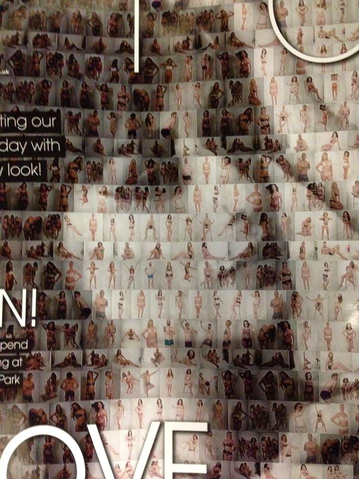 Front Cover/Model/Camera Shots- Although the model on ETC is a faded image made up of other images I think the effect this has makes the front cover stand out as you have to really focus on the image to work out what the smaller more detailed images are. However this front cover idea obviously isn't an option for me due to the time scale that I have and the monumental work that would have to go into making something similar to that. Luxe magazine has used a model and a prop which is very suited the the models look and the magazines theme for the double page spread. The image has a sepia effect which also ties in with the vintage look the model has. Both models are female which is the same gender as what I want to use for mine. Typically females are the most popular choice for fashion magazine, even in the international magazine VOGUE for example has only ever had 5 men on the cover. After looking at both front covers you can clearly see that they are closeups of the face however the Luxe magazines model is borderline a mid shot. Although as a fashion magazine you would expect a mid shot-long shot to show off the clothes, however after looking at various VOGUE magazine covers I have noticed that they do vary in camera shots.


These VOGUE front covers do use different camera shots therefore I now feel more confident that a close up will be acceptable as a regional and international magazine have both used one. The mast head also has been placed either in front or behind the model, The long shot front cover has placed the "G" behind the models head however you can still kind of see it however as the magazine is well known there isn't any worry that the customer buying the magazine wouldn't know what the name is. The other front covers have placed it in front of the models head, furthermore the mast head haven't blocked the models massively to the point where it looks stupid, the contrasting colors of the head mast and the models skin tone/hair make the title stand out.
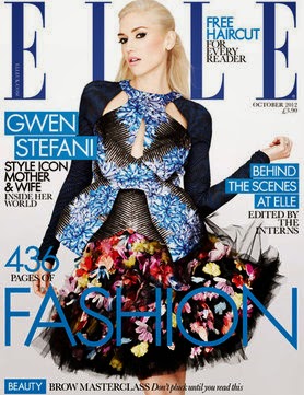 Colour Scheme-These fashion magazines have relatively bright colour scheme which means that they create a fresh looking feel and make the magazine come accross more feminine and attractive. However the simplistic colors black and white are extremely popular for the likes of mast heads and sell lines. The text on most fashion magazines is in a font which will make it stand out and make it look appealing. Certain magazines pull a color which ties in with the image or the background for example on this magazine the blue has been pulled out and used to make the magazine look extremely put together and professional. Furthermore the colors used in a fashion magazine are really used to compliment the model and the clothing.
Content/Double Page Spreads- In the fashion magazines I have found that the double page spreads are hugely focused on the image rather then masses of text, this I think is mostly because they are fashion magazines therefore the main focus should be the fashion element of the piece, e.g. the clothes, hair and makeup. On the other hand the text involved is very complimentary of the image, and so it should be.
After looking at the fashion magazines and the conventions I now feel confident in making my own and what I should include.


