For this question I used PowToon to answer.
Wednesday, 13 May 2015

Evaluation Question 3
What have you learned from your audience feedback?
This is a video of my ideal reader.
Straight away when starting to come up with the idea for my magazine I knew that I wanted the target audience to be a group that I myself would fit into, for example 16 years onwards, I wanted a more mature looking magazine to go with the audience, this is why I thought it would be ideal to have that age range for a target audience. I then took this and decided to create a Facebook page and invite people of that age group to like the page and answer various questions I had concerning different conventions of magazines. I used Facebook as a way to ask my target audience things about magazines and what they wanted in a magazine. I asked questions such as how much they would pay, what model they would want and the overall look of a magazine they preferred.
For example:

This feedback helped me decide on a price for the magazine, As the people who answered were all within the target audience, I used these as marker to decided a happy medium price.

I also wanted to feedback about what the reader would like inside the magazine, for example would they like loads of text and a little writing or little writing and loads of images. I had my own personal opinions however I wanted clarification that I was making the right decision.
 Getting feedback about what overall look of the magazine they liked helped the most, due to me having mixed feelings about which direction I wanted to take. When they feedback from the focus group explained that the vogue cover was the best, this gave me the push to go in the monotone direction, However I took some elements from the company magazine, but calmed it down and presented them in my own way.

Overall I think getting audience feedback helped a great deal with the final decisions with my magazine, Simply because I did have my own idea of what I wanted to put in the magazine, however I also wasn't sure about certain things, I learned that it is always good to get various peoples opinions so you don't have a bias view on your product.Throughout this process I have made sure that I has other peoples opinions just to help with the success of the magazines look.
Wednesday, 25 March 2015
Final Product- 2nd Ancillary Task

For my home page I wanted to have a very simple design, therefore I created just one block and then separated it by using lines and black boxes.
I used the same image as my billboard as I the idea would be that with the season they would both change and be the same.
I then included images not the bottom of the page to help give the user an insight to what is on the website and what they can find on the other pages.
Everything was very black and white except various small aspects which are presented in the bright pink which I think ties in well with the target audience.

Website/Gallery
For this page I wanted to include a lot of images from my friends, to get the feeling that the images had been submitted by readers of the magazine, For example various selfies were added which is very typical of my target audience and is very popular today all around the world.
I included images of makeup, nails, selfies, clothes and accessories. These helped me achieve the look i wanted for my target audience, I wanted the website to be very reader orientated, as this means they are very supportive of the magazine and enjoy reading it.
I think the color usage overall was very natural and makes the images tie in well together.

Website/Subscribe
For this page I had to quickly construct some 'La Mode' front covers so it looks like there was various issues before. I did this by just using some images and changing the color of La Mode.
I then used a large box to have information about subscribing to the magazine, and perks to subscribing.
Final Product- 1st Ancillary Task

For my billboard I wanted a striking image, this was achieved I think through the background and the abstract shapes created by the shadows.
I also decided to have the model looking away from the camera, Also the shadows make the fur on the coat stand out as they are highlighted in certain areas.
Final Product- Magazine

This is my completed front cover.
I used a bight blue color to help make my winter theme evident, However I then used the raspberry color to anchor down the imagine, as the lipstick my model is wearing is the same color.
I decided to choose sell lines which also tie in with the region and with the winter theme. For example I mentioned the north east, and a footwear which is typically worn around winter time.
My model is wearing a sweater which is then used to choose the main sell line, this is then for my double page spread.

Like the front cover I used the blue and raspberry colors to help provide continuity and to make sure they looked like they belong to the same magazine.
The image is also in black and white which I think helps it stand out but also not be a distraction.
I decided to include a lot of contents as this is what I feel will typically be in a regional magazine, Furthermore the contents were very anchored to the region we are in.
My editors note is then segregated from the rest of the text by having it in another color and in a box.

I decided to use the lipstick again to help anchor the text and image together. By using a brighter raspberry color I think it helps make certain text stand out more.
I wanted the image to be very larger, therefore I ensured that it would go onto both pages.
The model is also looking towards the text which draws attention to it.
Wednesday, 11 March 2015
March 2015 Update
Since my last update I have completed my second ancillary task which is my website. This was created using Wix website creator, I found the website easy to use once I was familiar with the website and the tools which were required for me to create the website.


Home Page
Gallery
Subscribe
The link to my website is: http://paigelittle96.wix.com/lamode
Since completing all of my products I handed them in to be reviewed by my lecturer.
I changed my contents age due to the response i got front he first draft, I decided to lighten the blue color to make it less dingy and more vibrant and fitting to my target audience. By lightening the color, it instantly made the contents page look more fresh and young.
My updated contents page:
Wednesday, 14 January 2015
Peer and Self Assessment of Blog

Some improvements included to possible add a little more detail on certain posts, to update my blog now that we are in 2015 and to add more time management posts.
If I was to self assess my blog I would say that I should update my blog more now that we are in the new year and that we have comeback from having two-three weeks off over the christmas period. However I feel like the posts prior to this are all up to scratch and include the correct amount of information needed for the certain posts.
Wednesday, 7 January 2015
Start of 2015 - Update
As we are now into the new year I thought it would be ideal to write a post based on the development of my magazine and ancillary tasks, and where they currently stand in terms of completion.
Front Page;
At the minute my front cover I feel is not far from from being complete, For example I feel like only a few variables of the front cover need changing, or slightly adjusting.


Front Page;
At the minute my front cover I feel is not far from from being complete, For example I feel like only a few variables of the front cover need changing, or slightly adjusting.
Contents Page;
Yet again, I feel like my contents page is also at the same stage of my front cover, however I feel like I may need to change the color of the editors note text back to white as I feel like the red doesn't make it stand out enough. Furthermore I feel like the Content Page's lay out is complete.
Double Page Spread;
I feel like there is nothing more to add, however the sizing of some text and the image may need altering to make the double page spread look more professional.
Billboard;
When creating the billboard I wanted it to be very simple, but effective so I chose to make it in black and white, By using the abstract image it makes the billboard stand out, due to the contrasting shapes which the shadows create.
Wednesday, 26 November 2014
Contents Page Development
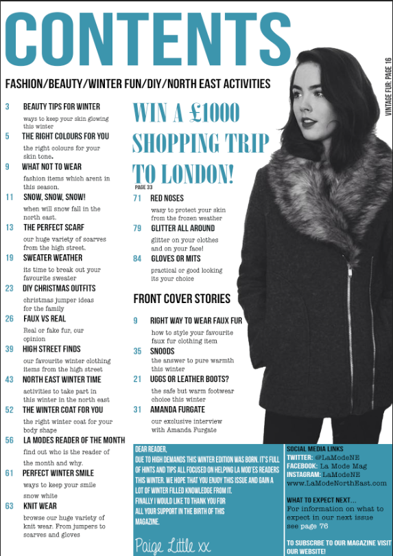
Since last time my contents page has really excelled, due to it being almost completed. I have added the main image and all the contents. I also added a editors note, and further social media networking site in the box located in the bottom right corner. I also added a small competition area, which stands out amongst the rest of the text. I carried on with the Teal color as I like the way they color scheme looks with everything in the magazine. The only thing left to do on this contents page is to add a small image of an editor in the editors note section.
Wednesday, 12 November 2014
Front Cover - So Far
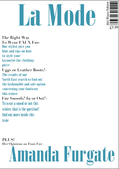
So far, As I haven't took my photos I have managed to put together the magazine's layout and the text. Of course when I add the images I may need to move things around but for now this is how i want the magazine's front cover to look. The front cover image needs to help with the color scheme but also it has to be able to tie in well with the winter edition theme I have gone for.
I have used two man in colors, Black and Teal. I think the teal really helps makes the magazine look more wintery. This color will then be used more inside the magazine.
Contents Page - So Far

So Far, like my font cover I have made the layout and text of this page, I will add the pictures at a later date. The same colors have been used and the fonts vary depending on the types of information. I added an editors note, due to the magazine being only regional I feel like this makes it feels more communal and easier to approach.
Doble Page Spread - So Far

Finally I am still waiting on the images for my double page spread. I have made up the story and adapted it to fit the issue of the magazine, The winter edition. I made up the person and made the sell line controversial which would cause discussions which in turn would create more sales for the magazine. By using the topic of fur I am using the winter theme. I didn't want too much writing so I just made a small paragraph then advertised the website. page numbers have also been added.
Wednesday, 5 November 2014
Test Shots
I first took the image and then decided to edit it to see which effect worked best for the coat and made it look more comfy and suitable for winter. I decided to just increase the contrast and shadows on the first one, By doing this i made the coats texture look more prominant, However I didnt edit it too much as I didnt want it to look too dark and unappealing. The seconda image was then edited to increase the brightness and warmth therefore it would make it look more bright and cosy, Which is what I want however as a consequence the editing makes the coat look a bit too bright and makes it look cheaper, Therefore if I was to use this edit then I would have to make sure that I dont make the brightness too high. I then tested the image in black and white, by doing this it fits in with my colour scheme however it also makes the coat look very high fashion, where as its from a highstreet shop.


As part of my earlier research and planning I was asked to reconstruct a magazine front cover, the image i used for this was of the same person and she was wearing another winter appropriate coat, This is also another test image which includes a item of clothing which could be used in my magazine. I went through the same process with these images, and edited them the same as the ones above.


Organising Test Shots

Initial Clothing Ideas
When coming up with the ideas for my costume and what I want the model to look like I want to get inspiration from other winter edition magazines. I think I am certain on having my model wearing a large wintery coat, preferable with fur and warm looking clothing. I will include images of the type of garments i will expect to be featured in my winter edition magazine.

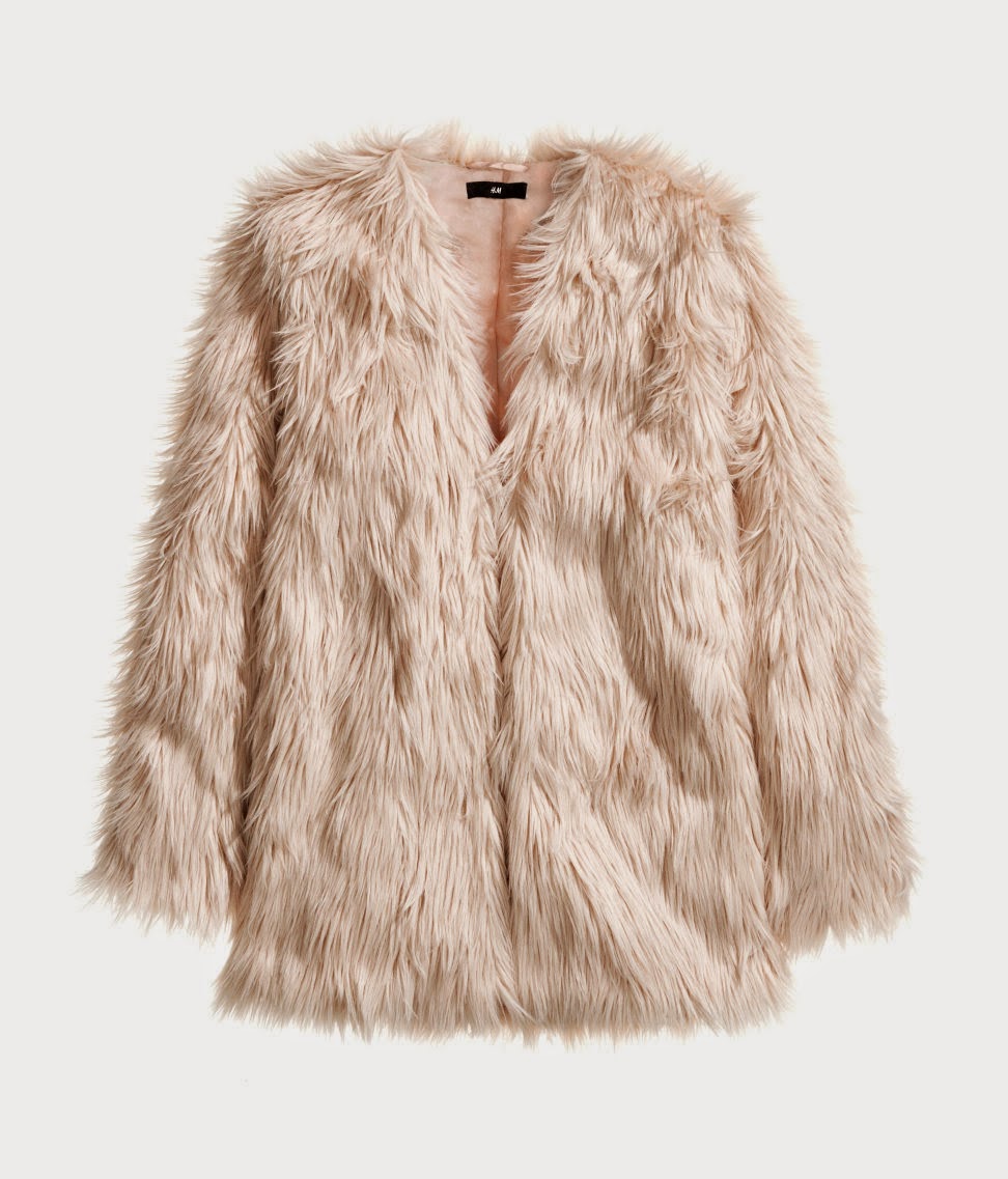
As I have a friend who owns these particular coats, I am going to ask permission to use one of them in my magazine, but first I will take some test shots to see how the coat looks and if its what I'm looking for to have in my magazine.
Wednesday, 22 October 2014
Self Assessment


As part of a marking exercise we were asked to mark our own blogs based on the same criteria as the Peer Assessment task we did. I decided that I think my blog so far is at a much higher standard than last year, and last year I was given only a D for my research and planning. Based on my posts and the content in the posts is relatively proficient and at a better level than last year. I gave my blog so far 13 marks which is a grade C, Level 3. However I am yet to complete my blog therefore I hope to improve it to a even higher level upon completion.
Wednesday, 15 October 2014
Magazine Name- Final Decision
After thinking about magazine name I want to come up with names that really represent a successful magazine. Therefore I have thought of some more name to accompany the front runner, Exposure. For example names such as La Mode, Forma.
I chose the new three options because I liked the idea of using the word fashion and changing the language to come up with another way of having my magazine called fashion without it coming across tacky.
When looking at the new names I really like "La Mode" because it sounds very fancy and really shows connotations of fashion. As its int eh french language where fashion really blossoms I feel like this is a really goof choice for my magazine.
To develop this Idea i have decided to see what it looks like in the different fonts I chose.

I chose the new three options because I liked the idea of using the word fashion and changing the language to come up with another way of having my magazine called fashion without it coming across tacky.
When looking at the new names I really like "La Mode" because it sounds very fancy and really shows connotations of fashion. As its int eh french language where fashion really blossoms I feel like this is a really goof choice for my magazine.
To develop this Idea i have decided to see what it looks like in the different fonts I chose.
Finally the chosen name for my magazine is La Mode.
Front Cover Extended Flat Plan - Fonts

I chose two different fonts, a more structured font called 'Bebas Neue' which is used for the Mast head, Sell lines and the Main Sell line. I then chose a more laid back font called 'lazing on a sunday afternoon' which was used for the descriptions, issue number and the price.
I chose these fonts because I think they look good together and they represent the genre of magazine I want.
However as I am yet to decide on the sell line the font may change because the particular words may not look right in the font I have chosen at the moment.
Subscribe to:
Posts (Atom)