VOGUE
To see the double page spread I am deconstructing in an INSUU page turner presentation;
http://issuu.com/conde-nast-digital/docs/06-14welltestinovo47154-014?e=0/9442976
Alternatively I will include an image of the double page spread for ease of reading my deconstruction.
This double page spread is very focused on the main image. The image and its background takes up the full two pages and is used for a background for the white text on the page. The tranquil colors really represent the month that this vogue issue was released, in June. As it was June the color would have to represent spring/summer and I feel like Vogue achieved this by having an oceanic background. The white text is then used to show the contrast. The font chosen is very classy and laid back so this also helps to make the double page spread look relaxed and calm.
The models outfit is very limited however it is high fashion in terms of the swimsuit involvement of this double page spread. The bright yellow bikini top is fitting with the blues and greens which is present in this double page spread. The bikini allows a lot of skin to be shown which is typical of a summer double page spread, as summer typically represents beaches, sun and of course bikinis. The props that the model has are also swimming equipment which makes the overall theme of the magazine tie in really well and fluently, For example the flippers and her sunglasses. Her appearance is also well tied in with this theme as her hair is very windswept and wet looking due to the surroundings, such as the sea and sand.
The language used in this small piece of text is very descriptive of the models career and what she is currently doing with her life. The text included language such as "conquered" and "silenced her critics" this makes the model seem very dominate, which is how she appears in this photo as she is presented in a mid shot which draws the reader immediately to her. Also the mast head of the page "Venus rising" has connotations of various paintings, which all have the image of a naked women, beautifully painted to make her look sophisticated and attractive. The small paragraph at the bottom of the page is basically just an index of what the model is wearing, where you can buy it and how uch it is.
I really like the layout of this double page spread, due to the lack of text the focus is dominantly on the model and her outfit, however as this pictures obviously isn't a good representation of clothing and fashion as she isn't really wearing a huge amount of clothes, However the whole theme and layout of thus double page spread I will definitely consider to be a huge inspiration for my own product, and I plan to use the idea of the background and colors creating a relaxing and comfortable mood to the look of the magazine.
Thursday, 4 September 2014
Wednesday, 3 September 2014
Double Page Spread Deconstructions- Part 2/3
Bazaar
This double page spread is from a famous fashion magazine called Bazaar. There are two images on this page, one take up a quarter of a page whereas the other one take up a full page. This image obviously accompanies the text to the left of it. The smaller image is of an older women facing away from the camera. This photo can be seen has quite editorial as she is facing away and has a very desired look on her face. The other image is of a well known actress Jennifer Aniston. Due to her fame she can create a lot of publicity for this magazine as it features her. The pose is quite cute looking and relaxed as she has her hands on her hips. The clothing is also simple and allow the attention to be more focused on the actual model. Her hair is very natural looking as a fan is used to make the hair look more animated and 3D. Both pictures are also in a black and white effect however there is a slight sepia feel to them as the color beige is running throughout the pictures.
The mast head to this page is in a traditional looking font and makes the title stand out. Then the sub heading beneath it is in the same font but a smaller size to distinguish the different information. Beneath this there is then a brief introduction to the photographer of these two images, written in a bold font. The text is then started with a over size capital 'F' which is very traditional again, as this is often used in books and older pieces of text. The actual text is then in one column which is the same width as the image to the left of it. The text is in a black font which is contrasting with the white background. The text to accompany the main image is in the same color which again contrasts with the white. The text includes vocabulary such as natural, effortless, healthy and stylish. These adjectives paint the model in a very appealing way and make her seem like the ideal woman.
I really like the layout of this page because it really uses the images well and doesn't look too much. However there isn't page numbers on this double page spread therefore if I was too use this for inspiration that would be the change I would make. I really like the variation of boldness on the mast head, I will be using this double page spread for inspiration, as I really like how the overall look of the page makes the reader feel like they are reading a well known fashion magazine.
Tuesday, 2 September 2014
Double Page Spread Deconstructions- Part 3/3
ETC
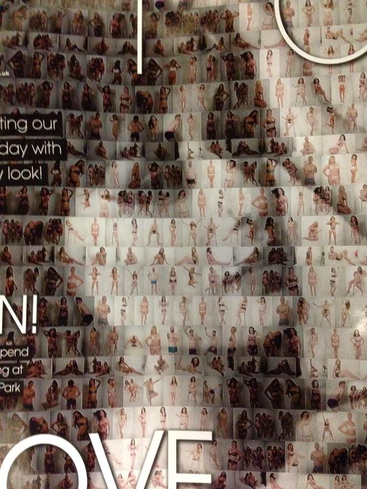
The small columns of text are very inspiration and really make the reader feel good about themselves. The mast head of the page is in two different sizes the word 'every' in in a smaller font that the word 'body' which is fitting as the full page is full of people with their bodies showing, however this really anchors down the whole theme. The main text is on a white rectangle box which poses as the background for the text, The white contrasts with the black to make it stand out and be readable. Various twitter user names are also strapped along the bottom of the page which means this double page spread is interactive and supports social medias input.
There is page number on the bottom of the page which have small white boxes behind them to make sure that they stand out. There is a sticker on the right side of the page which has the twitter logo printer on very faintly but, the opacity is high enough so we can still see what it is. There is a huge social network involvement for this page which means that the readers can have input and share their opinions.
I really this the social media aspect of this double page spread, Therefore I will take this into consideration when making my magazine. I like how the article carries a important message therefore I will also include this into my writing. Unfortunately, although I really like the theme of this double page spread, I really don't think this represents the genre fashion very well, therefore I will have to still apply a message to mine but make sure fashion is present throughout the double page spread.
Friday, 29 August 2014
Conventions Of My Chosen Genre
I myself am making a magazine, therefore I thought it would be fitting to research magazines in the same genre as mine to see what I can do to make the most accurate magazine possible to fit my genre. My chosen genre is fashion, therefore I have been looking at other fashion magazines to see what they do similar and what makes them different from other magazine genres. I have decided to use regional fashion magazines to help with my research for this particular section of my coursework. However I will also be looking at more popular magazines to help as I haven't yet found enough evidence from regional magazines to fully analyze the conventions of a regional fashion magazine.
Regional Magazines-(ETC and LUXE);
Front Cover/Model/Camera Shots- Although the model on ETC is a faded image made up of other images I think the effect this has makes the front cover stand out as you have to really focus on the image to work out what the smaller more detailed images are. However this front cover idea obviously isn't an option for me due to the time scale that I have and the monumental work that would have to go into making something similar to that. Luxe magazine has used a model and a prop which is very suited the the models look and the magazines theme for the double page spread. The image has a sepia effect which also ties in with the vintage look the model has. Both models are female which is the same gender as what I want to use for mine. Typically females are the most popular choice for fashion magazine, even in the international magazine VOGUE for example has only ever had 5 men on the cover. After looking at both front covers you can clearly see that they are closeups of the face however the Luxe magazines model is borderline a mid shot. Although as a fashion magazine you would expect a mid shot-long shot to show off the clothes, however after looking at various VOGUE magazine covers I have noticed that they do vary in camera shots.
Colour Scheme-These fashion magazines have relatively bright colour scheme which means that they create a fresh looking feel and make the magazine come accross more feminine and attractive. However the simplistic colors black and white are extremely popular for the likes of mast heads and sell lines. The text on most fashion magazines is in a font which will make it stand out and make it look appealing. Certain magazines pull a color which ties in with the image or the background for example on this magazine the blue has been pulled out and used to make the magazine look extremely put together and professional. Furthermore the colors used in a fashion magazine are really used to compliment the model and the clothing.
Content/Double Page Spreads- In the fashion magazines I have found that the double page spreads are hugely focused on the image rather then masses of text, this I think is mostly because they are fashion magazines therefore the main focus should be the fashion element of the piece, e.g. the clothes, hair and makeup. On the other hand the text involved is very complimentary of the image, and so it should be.
Regional Magazines-(ETC and LUXE);
After looking at both these regional magazine I have decided to take certain conventions and analyze them carefully to see what they do similar and differently.
Name/Mast Head- Both magazines have short names which means that they are typically more easier to remember. As not only these magazine have short names other national/international magazines also follow this theme for example ELLE, VOGUE, and BAZAAR. The placement of each mast head on these two magazines are different, ETC positioned their mast head along the top of the page and is stretched to fit the full width of the page. Luxe magazine however placed the mast head slightly off set of the middle of the page, more positioned to the bottom.
Front Cover/Model/Camera Shots- Although the model on ETC is a faded image made up of other images I think the effect this has makes the front cover stand out as you have to really focus on the image to work out what the smaller more detailed images are. However this front cover idea obviously isn't an option for me due to the time scale that I have and the monumental work that would have to go into making something similar to that. Luxe magazine has used a model and a prop which is very suited the the models look and the magazines theme for the double page spread. The image has a sepia effect which also ties in with the vintage look the model has. Both models are female which is the same gender as what I want to use for mine. Typically females are the most popular choice for fashion magazine, even in the international magazine VOGUE for example has only ever had 5 men on the cover. After looking at both front covers you can clearly see that they are closeups of the face however the Luxe magazines model is borderline a mid shot. Although as a fashion magazine you would expect a mid shot-long shot to show off the clothes, however after looking at various VOGUE magazine covers I have noticed that they do vary in camera shots.
These VOGUE front covers do use different camera shots therefore I now feel more confident that a close up will be acceptable as a regional and international magazine have both used one. The mast head also has been placed either in front or behind the model, The long shot front cover has placed the "G" behind the models head however you can still kind of see it however as the magazine is well known there isn't any worry that the customer buying the magazine wouldn't know what the name is. The other front covers have placed it in front of the models head, furthermore the mast head haven't blocked the models massively to the point where it looks stupid, the contrasting colors of the head mast and the models skin tone/hair make the title stand out.
Colour Scheme-These fashion magazines have relatively bright colour scheme which means that they create a fresh looking feel and make the magazine come accross more feminine and attractive. However the simplistic colors black and white are extremely popular for the likes of mast heads and sell lines. The text on most fashion magazines is in a font which will make it stand out and make it look appealing. Certain magazines pull a color which ties in with the image or the background for example on this magazine the blue has been pulled out and used to make the magazine look extremely put together and professional. Furthermore the colors used in a fashion magazine are really used to compliment the model and the clothing.Content/Double Page Spreads- In the fashion magazines I have found that the double page spreads are hugely focused on the image rather then masses of text, this I think is mostly because they are fashion magazines therefore the main focus should be the fashion element of the piece, e.g. the clothes, hair and makeup. On the other hand the text involved is very complimentary of the image, and so it should be.
After looking at the fashion magazines and the conventions I now feel confident in making my own and what I should include.
Wednesday, 27 August 2014
Action Plan
In order to keep up with all the A2 work, we have all been given a number of deadlines/ideas of when certain areas of our coursework should be complete,. By doing this it will help me keep focused on each section so I have time to dedicate to each component of my work.
Some examples of particular deadlines we have been given are;
By the end of September- My Research and Planning is expected to be on the borderline of completion, with little errors and almost perfect! Then if need I could alter any faults in my posts and make them better and of a higher level. Excepts from little alterations my research should be DONE.
October half term- The photography for my magazine should be done, meaning I have the rough images with no editing.
First week in December- My product needs to be finished. The first four pages of my magazine should be complete including images and content, NO extra touches should be needed!
By Christmas- My First Ancillary task should be finished, which is my 2 hyperlinked pages from a website for my magazine.
First week back in January- My second ancillary task should be complete, which is my billboard advertisement.
By February- My full evaluation should be complete and uploaded onto my blog, which should be the final post on my blog, indicating the completion of my A2 Media coursework.
Some examples of particular deadlines we have been given are;
By the end of September- My Research and Planning is expected to be on the borderline of completion, with little errors and almost perfect! Then if need I could alter any faults in my posts and make them better and of a higher level. Excepts from little alterations my research should be DONE.
October half term- The photography for my magazine should be done, meaning I have the rough images with no editing.
First week in December- My product needs to be finished. The first four pages of my magazine should be complete including images and content, NO extra touches should be needed!
By Christmas- My First Ancillary task should be finished, which is my 2 hyperlinked pages from a website for my magazine.
First week back in January- My second ancillary task should be complete, which is my billboard advertisement.
By February- My full evaluation should be complete and uploaded onto my blog, which should be the final post on my blog, indicating the completion of my A2 Media coursework.
Inspirational Texts
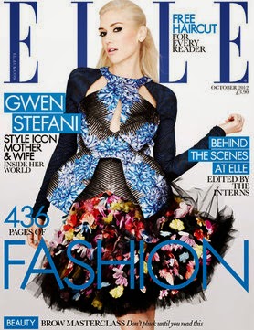
To gain inspiration for my magazine I decided to search the internet for "high fashion magazine front covers". The search brought up magazines varying from ELLE, BAZAAR, COMPANY and VOGUE, although these aren't regional magazines I found them very useful as they showed certain aspects of the type of magazine I want to create, for example the way the conventions of a front cover were set out, colour schemes and models. Here are the results of this search;
I then went to search for contents pages and double page spreads. By doing this I could get an even better understanding of what I want mine to be inspired and modelled from. I searched each of the previous four magazines but this time using "contents page" or "double page spread". Here are the results of this search;
After searching I then realised that I would like to use the fashion magazine "VOGUE" as my inspiration as the front cover, contents page and double page spreads from this magazines company are very sinilar to how I picture my magazine to look. I like how the magazine use primary colours paired with black and white to make a statement which is what I want for my magazine. I want the monochrome theme to play a bit part in my fashion magazine, as for the contents page I love how there is one main image which is strong, therefore it doesn't require any other images beside it.
Overall after looking for inspiration I have decided that I want to go for the simplistic yet strong look for my magazine as I plan to have it designed based on the magazine I have gained inspiration from.
As a regional magazine inspiration I have been looking at magazines such as ETC and Luxe, as these are magazine from the north east I have looked at the pictures inside the magazine and used them for inspiration for my product
Inspirational Texts Part 2
Here is a short video showing inspiring pieces which will help with my research and planning. I will keep these in mind when designing my own magazine, billboard and 2 hyperlinked website pages.
Subscribe to:
Posts (Atom)